
AKPsi Website
UGA Alpha Kappa Psi Website
Overview
Role
UX/UI Designer, Website Developer
Overview
A website for the professional business fraternity Alpha Kappa Psi at UGA that showcases what the fraternity offers, their values, and how to become a member.
Toolkit
Wix, Pencil and paper
Background
I designed and developed a website for the Alpha Kappa Psi (AKPsi) Alpha Epsilon chapter at the University of Georgia. The goal was to create a platform that showcased the organization’s values, culture, and recruitment information, while staying consistent with both UGA’s branding and AKPsi’s identity. The site needed to be professional, yet approachable and easy to navigate for potential new members seeking insight into what to expect from the organization.
Goals
Create a responsive website that showcases AKPsi's values and personality as well as encourages users to explore what the fraternity has to offer and how to become a member.
Design Process
UX Design
Sitemap:
The first step I took in my design process was creating a sitemap to help plan out the hierarchy of my website as well as organize my thoughts so I would have a clear vision of what content I wanted to add to the website. I planned on having an 'About,' 'Executive Board,' 'Recruitment,' and 'Brothers' section based on a combination of common pages I saw on other AKPsi chapters' websites and what I noticed the Alpha Epsilon chapter did not have. It was very common to see an 'About' and 'Executive Board' section on other websites, so I knew I wanted to add those so that users could get a good grasp of what the organization is and who is part of it. I also noted that the Alpha Epsilon chapter only used GroupMe for communications, and while this was good for messaging, I noticed that people were constantly losing links and important resources. This led me to create a brothers-only page that housed links to our most important resources, such as the chapter's Google Drive.


Key
Wireframes:
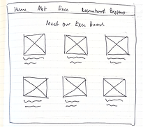
The next step I took was sketching out some low-fidelity wireframes to finish mapping out the core structure of the website. Here, I tried to focus on what content I wanted to be on each page, and how I should organize it so that it flowed naturally for the user. I created a wireframe for a Home, About, Executive Board, Recruitment, and Brothers page.
Home About Executive Board Recruitment Brothers


UI Design
Brand Identity:
After creating the layout for the website, I began developing the UI components and overall brand identity. I knew I wanted the website to feel fun, playful, and inviting, while still maintaining an air of professionalism consistent with the organization’s values. This vision led me to showcase as many photos as possible and lean heavily into image-based storytelling, using full-width background photos with a parallax effect to create depth and visual interest.
Because these backgrounds introduced a wide range of colors and tones, I chose to work with a limited palette of three core colors and two complementary font families to maintain consistency and balance across the design. The colors I chose came from one of the two official colors of Alpha Kappa Psi, Navy Blue.
Color Palette
#FFFFFF
#364875
#19294F
Typography
Header, Cormorant Garamond Semi Bold 82px Regular
H2, Cormorant Garamond Semi Bold 56px Regular
H3, Cormorant Garamond Semi Bold 48px Regular
P, Cormorant Garamond Semi Bold 20px Regular
P2, Alfabet 15px Regular
Final Prototype
View the live website here at ugaakpsi.com


Home
After creating the layout for the website, I began developing the UI components and overall brand identity. I knew I wanted the website to feel fun, playful, and inviting,


About
For the 'About' page, I wanted to give users a glimpse into what AKPsi really looks like by showcasing the fraternity's history, accomplishments, and memories through a collage of photos.


Executive Board
On the 'Executive Board' page, I created a clean interface with animations to break up the monotony of the design that showcased all of the executive board members' names, positions, and pictures. Users can click on their portraits to learn more information about the board members.


Recruitment
The recruitment page is one of the most important pages, since it is likely what most new users will be looking for if they are interested in joining the organization. I made sure to add information about recruitment with an immediate call to action button afterwards that leads users to fill out the interest form. I also made sure to display the recruitment schedule and created a section for frequently asked questions.


Brothers
Finally, I created the password-protected page for brothers only. This page houses all of the important links and resources for the chapter, as well as a calendar that displays all of the events for the month.


Outcomes
Impact
Following the launch of the redesigned Alpha Kappa Psi website, traffic and engagement metrics showed a substantial increase. Using Wix Analytics, I evaluated site performance between January and November 2025 to assess how the new design impacted visitor engagement, navigation, and overall visibility.
Key Results:
-
Significant Traffic Growth: Monthly visitors saw a dramatic surge beginning in August and September, with over 600 unique visitors per month compared to fewer than 100 in earlier months.
-
Increase in User Engagement:
-
Site sessions rose by more than 600%, reaching over 750 sessions in August.
-
Page views climbed to nearly 1,900 in August, representing a 1,500% increase over the pre-launch average.
-
-
Sustained Interest: Even after peak recruitment months, site activity remained higher than in the first half of the year, indicating lasting engagement and improved discoverability.
-
Optimized User Flow: The redesign’s simplified navigation and clear call-to-action buttons led to higher interaction with key pages such as 'Interest Form,' 'Recruitment,' and 'Learn More,' as reflected in the traffic distribution across site sections.
Summary:
The redesigned Alpha Kappa Psi website successfully elevated the fraternity’s digital presence, driving significant growth in traffic and engagement during crucial recruitment periods. By combining a cohesive visual identity with user-centered design improvements, the site not only increased visibility and credibility but also created a more intuitive and engaging experience for visitors—directly supporting the organization’s outreach and recruitment goals.
Challenges
One of the primary challenges was aligning the site with a very specific brand style, playful, energetic, and image-heavy, while still maintaining readability and accessibility. Incorporating multiple background images on the homepage made it difficult to preserve text clarity, requiring careful adjustments in layout, contrast, and hierarchy. Another challenge was experimenting with animations and parallax effects to make the site feel dynamic without it being distracting. Finding this balance demanded a lot of iteration and testing across devices. Additionally, adapting the design to different screen sizes introduced new hurdles, as image-heavy and animated layouts can easily lose cohesion on mobile.
Lessons Learned
Through this project, I learned how to redesign complex, visual-heavy layouts for responsiveness so that they remained consistent and intuitive across desktop and mobile. I also gained experience in balancing creativity with usability, discovering how to push design elements like animations and parallax backgrounds without sacrificing clarity or professionalism. Most importantly, this project taught me how to merge organizational branding requirements with user-centered design principles, resulting in a website that not only communicates AKPsi’s mission but also provides an engaging and accessible experience for prospective members.