Navis
An AI-powered customer service platform.
Overview
Role
Creative Director, UX Researcher, UX/UI Designer, Graphic Designer
Overview
AI-powered customer service platform that bridges the gap between human agents and automation. It enhances call centers and startups by increasing customer service representative efficiency to improve customer satisfaction.
Toolkit
Figma, Adobe Illustrator, Pencil and paper
Background
Customer service is often plagued by long wait times and inconsistent answers, leaving customers frustrated and dissatisfied. Representatives face the challenge of navigating scattered knowledge bases and limited training while under pressure to resolve issues quickly. Navis addresses this problem by providing an AI assistant that delivers instant document retrieval and real-time call analysis, enabling faster, more accurate, and personalized support.
Goals
Create a landing page prompting users to try out the service and a software interface that is intuitive, easy to navigate, and displays the capabilities of the product.
Research
Methodologies: Competitive analysis | User interviews
Competitive Analysis

User Interviews
Overview:
2 men and 1 woman ages 23-28 have been interviewed. Among them, two work in the customer service industry, and one as a startup founder.
All interviews have been conducted remotely.
Affinity Mapping:

Findings:
Frustration with Inefficient Systems
Users expressed strong frustration with slow, buggy, or outdated software that often interrupts their workflow. Many still rely on manual workarounds due to missing automation or unreliable features.
Need for Smarter Automation and AI
Agents want automation that genuinely reduces repetitive work, not just AI “add-ons.” They’re most interested in tools that can summarize calls, schedule follow-ups, and categorize tickets intelligently.
Customization and Dashboard Clarity
Users appreciate clean interfaces but want more control over analytics and reporting. They value dashboards that are simple, real-time, and adaptable to their individual workflows.
Communication and Collaboration Gaps
Teams struggle with duplicate work and disjointed communication across calls, emails, and chats. They want unified, context-aware systems where agents can see customer activity and work together seamlessly.
User Personas:
Persona #1

Jordan Wake
27 y/o Customer Service Rep
Biography
Jordan is a customer service representative at a mid-sized tech company. He spends most of his day managing tickets, emails, and chat requests from customers. While he’s quick at responding, his biggest frustration is constantly switching between multiple tools to find the right information. He enjoys his job but often feels drained by repetitive questions and clunky software that slows him down. Jordan is open to AI-driven tools that could help him stay organized and reduce manual effort.
• To quickly access accurate information during customer interactions
• To have an interface that’s clean, intuitive, and easy to navigate under pressure
• To spend less time on repetitive tasks like note-taking and ticket sorting
Goals:
Frustrations:
• He feels frustrated when software lags or crashes in the middle of calls
• He wastes time searching through multiple tabs or documents for answers
• He dislikes when AI tools are "smart" in theory but fail to understand real workflows
Persona #2

Maya Davis
35 y/o Customer Experience Manager
Biography
Maya is customer experience manager at a growing startup. She oversees a small team of support agents and focuses on improving efficiency and customer satisfaction. Her day involves reviewing analytics, training new hires, and identifying workflow bottlenecks. Maya values clarity and consistency but often struggles with fragmented data and unreliable performance metrics. She’s constantly looking for tools that give her better visibility into team performance and customer sentiment without overcomplicating things.
• To gain real-time insights into her team’s performance and customer interactions
• To use data-driven analytics for training and performance reviews
• To maintain a consistent and high-quality customer experience
Goals:
Frustrations:
• She struggles with tools that require constant manual tracking or updates
• She finds most dashboards cluttered and hard to interpret quickly
• She’s frustrated when her team’s software lacks integration or context sharing across agents
Design Process
Goals and Priorities
Before developing Navis, the main goal was to design a customer service platform that balances technical intelligence with human usability. Research from competitive analysis and user interviews revealed that existing tools like Zendesk and Freshdesk often overwhelm users with cluttered interfaces and steep learning curves. Users expressed a desire for clarity, efficiency, and seamless integration of AI tools without losing personal connection or trust.
From these insights, the design priorities centered on:
-
Streamlining workflows to reduce clutter in ticket creation and management.
-
Integrating AI assistance using RAG to empower, rather than replace, support reps.
-
Building visual clarity through color-coded organization, intuitive navigation, and clean information hierarchy.
-
Establishing trust through branding, using water-inspired elements to represent adaptability, flow, and reliability.
Ultimately, Navis aimed to pioneer a more fluid, human-centered approach to customer support, one that adapts over time and evolves with technology while still keeping the users at the helm.
UX Design
Task Flow:
First, I started by creating one of the main task flows that would be used in the Navis software: creating a ticket. The flowchart is made up of start/end points, user choice option, page/section, and user input.


Wireframes:
With the user's needs established, I then sketched out some low-fidelity wireframes of both the website and the software to get an idea of the layout for my designs.


Home Page
Legal Page
Software Home
UI Design
Brand Identity:
The branding for Navis was built around the themes of adaptability, reliability, and exploration, reflecting a company that helps people navigate change with confidence. The name comes from the Latin word “navis,” meaning ship, and ties directly to the water-inspired concept of fluidity, transformation, and forward motion. It represents a brand that pioneers through the evolving world of AI while staying steady and dependable. Phonetically, Navis feels strong yet approachable: the “N” aligns it with forward-thinking brands like Nike and Netflix, while the “V” evokes energy and openness, mirroring the ocean’s vastness.
The logo combines the word Navis in a sleek sans-serif font with half of a traditional ship’s steering wheel, symbolizing navigation, control, and adaptability, which serves as a visual anchor for the brand’s identity. The color palette of deep blues and vibrant yellow accent balances trust and innovation. Blue communicates intelligence, reliability, and a connection to water, while yellow adds energy and contrast. Together, these elements create a brand that feels both professional and dynamic, embodying the idea of navigating progress with clarity and confidence.
UI Components:

Final Prototype
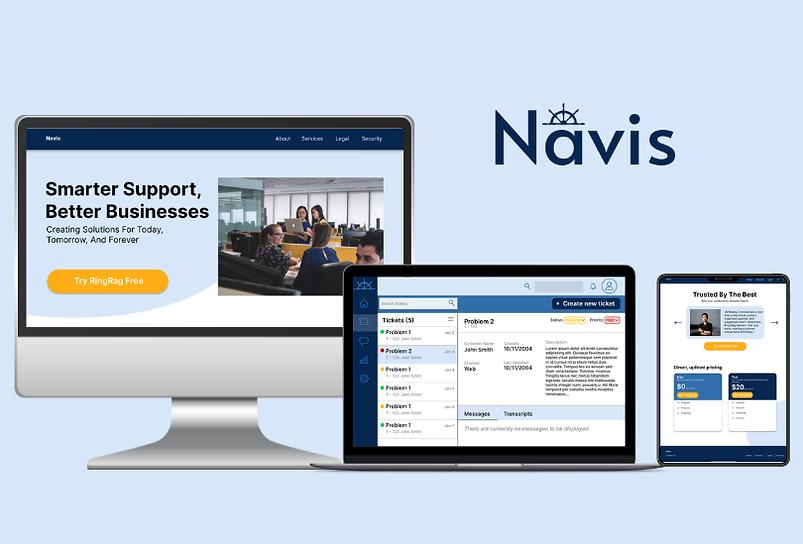
Website
Building the Navis landing page prototype was a really fun process. I designed and implemented a clean navbar and footer for consistent navigation, a bold hero section that encourages users to try the product, and an informative section highlighting what sets Navis apart from competitors. I also created interactive cards to showcase customer testimonials and pricing options, ensuring the page felt engaging, informative, and aligned with Navis’s professional yet approachable identity.

Software Interface
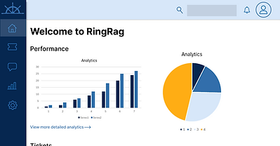
Designing the Navis software interface was also a very rewarding process. I created three main pages to reflect the task flow from earlier to create a new ticket. These pages include the homepage, the tickets dashboard, and the new ticket creation page, each built with clarity, accessibility, and user efficiency in mind. The homepage provides an overview of performance analytics and recent tickets, while the tickets page allows users to easily view, search, and filter cases by status. The “Create New Ticket” page features input fields, live call transcription, and an integrated RAG-powered assistant. Together, these elements form a cohesive and intuitive system that enhances productivity and delivers a smooth user experience.


Outcomes
Challenges
One of the main challenges I faced was designing the software interface, since my previous experience was primarily focused on web design. Translating my understanding of layout, navigation, and responsiveness into a product interface required me to think differently about hierarchy of information, and how to present features in a way that felt approachable. Another challenge was finding the right balance between communicating the technical complexity of the product without overwhelming the users.
Lessons Learned
I learned the importance of adapting my design principles to different contexts, moving beyond static web layouts into more dynamic, task-driven product design. I also discovered how critical it is to simplify complex systems into digestible user journeys, ensuring users feel empowered rather than intimidated.